Process Highlights
Design challenge & responsibilities overview
Challenge
Redesign the ecommerce website for Ort Farms.
Opportunity
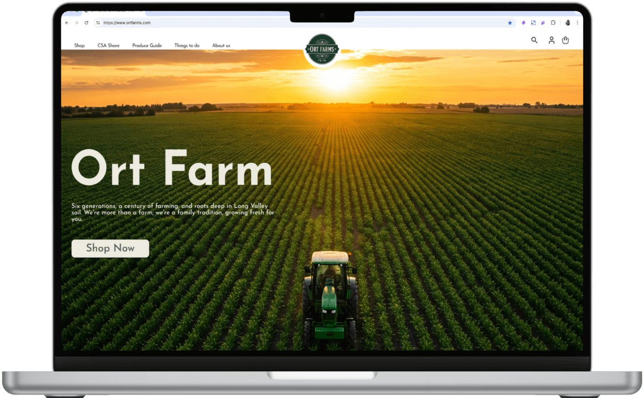
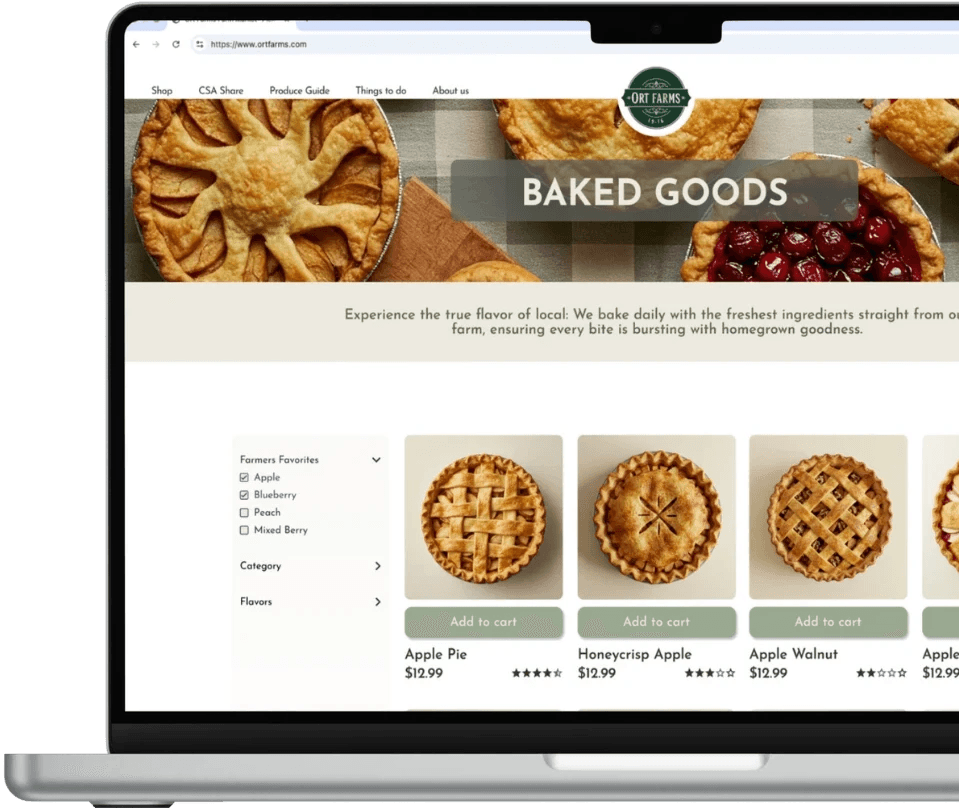
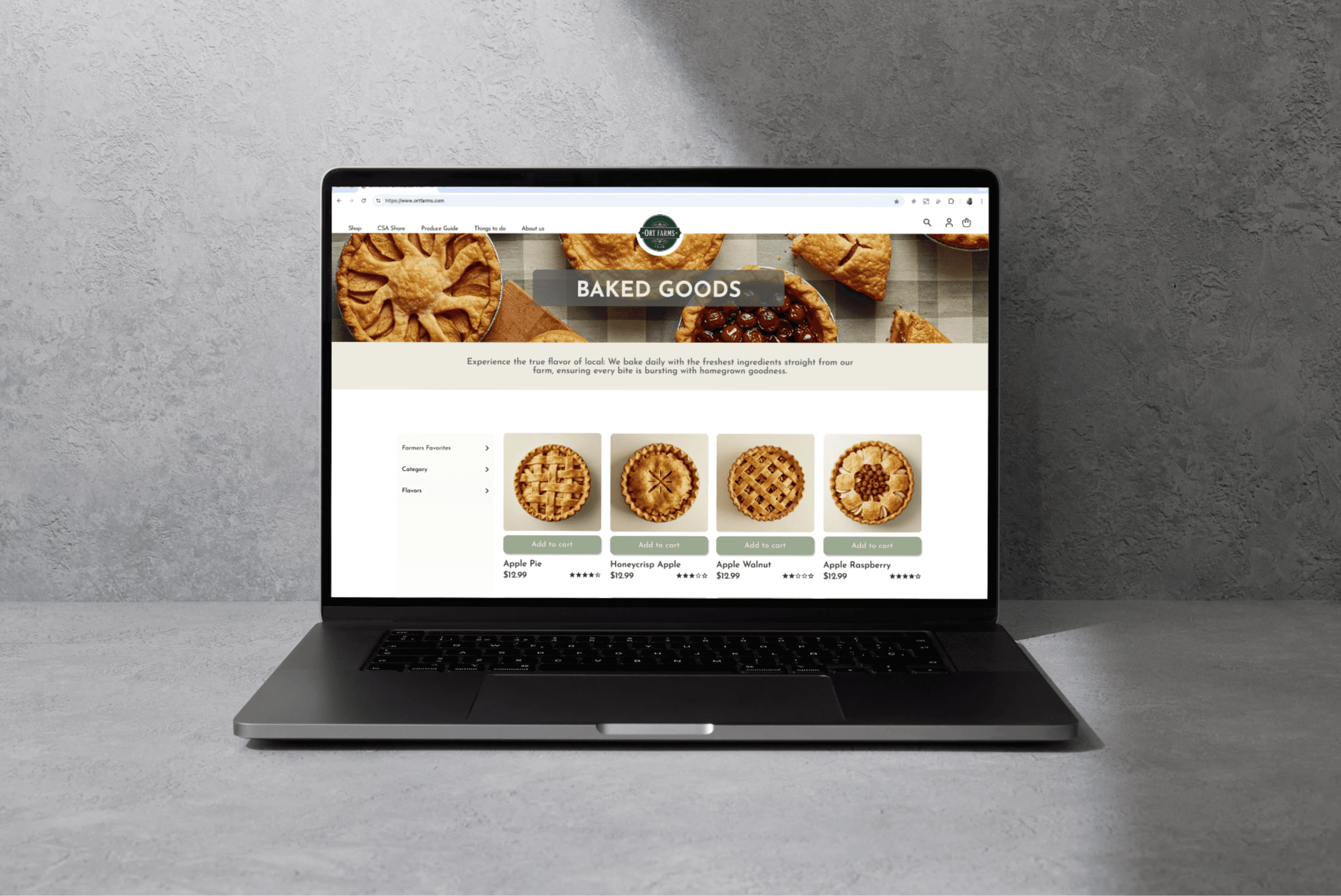
Redesign product landing page (PLP) & product description pages (PDP) to enhance searchability & enable an easier online shopping experience.
BACKGROUND
Not all is as expected.
Ort Farms is a small, family owned farm located in Long Valley, New Jersey. While they’re incredibly popular for in-person shopping, ecommerce customers found difficulty navigating their website and making purchases. What I learned during this redesign was to leave my own assumptions at the door. While the idea of placing all of their products into an easy to navigate, aesthetically pleasing website sounded great, I learned that customers really wanted to shop for certain items in person, but would look for information about these products online.
The Process.
Research
Competitive Analysis
User Interviews
Affinity Map
Synthesis
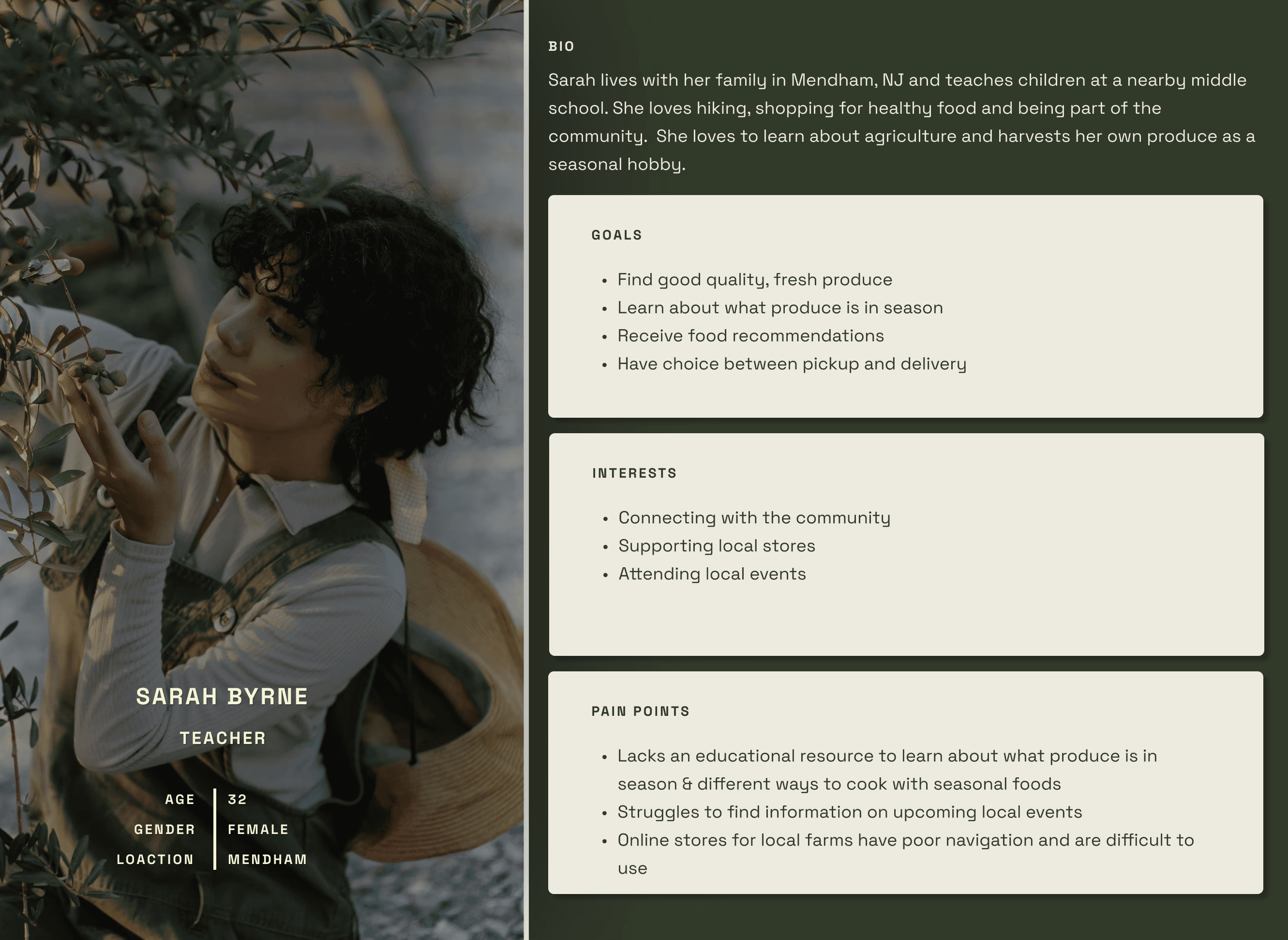
Persona
Problem Statement
Site Map
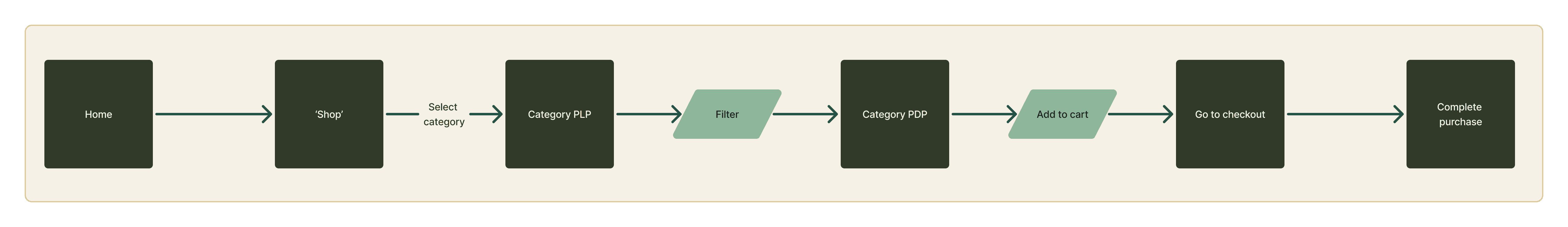
User Flow
Ideation
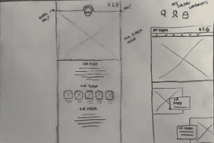
Sketches
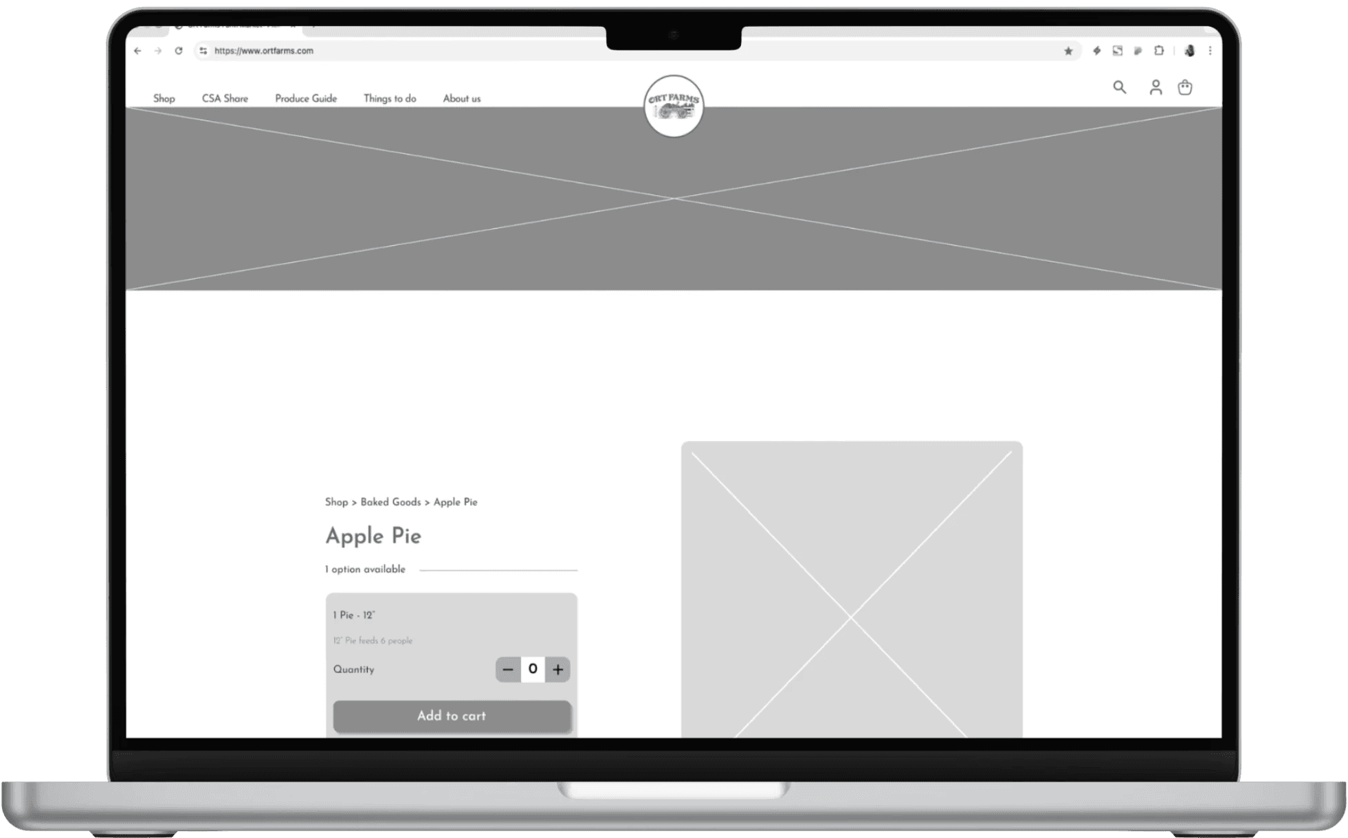
Wireframes
Hi Fi
Final Designs
Prototype
Usability Testing
Final Iterations
Reflection
Key learning
Conclusion
RESEARCH
Competitive & Comparative Analysis
Ort Farms resides in a rural part of New Jersey. The area is beautiful and filled with many other farms of different sizes and specialities. In my competitive analysis, I felt it to be necessary to compare large and small farms in the surrounding area, as well as local grocery stores. The comparative analysis, however, gave room in my research to look from a different angle. I researched local events (food truck festivals, for example), as well as a cider mill as these are popular in the local area and can certainly impact Ort Farms business.
Small Local Competitor: RH Farms
Pluses
Niche: Popular location specifically for apple picking
Developed reputation through word of mouth
Deltas
Small business: Limited offerings
Minimal social media footprint
Moderate Local Competitor: Tranquility Farms
Pluses
Large farmhouse: Spacious and an enjoyable shopping experience
Deltas
Location: Based in a more rural area
Large Local Competitor: Tranquility Farms
Pluses
Large farm: Large and very popular
Website Offerings: Lots of variety & information on the farms’ website
Deltas
Overcrowded: Can lose the charm of feeling local
Pricing: Due to high demand from out of town visitors, prices are generally very high