
Overview
Overview
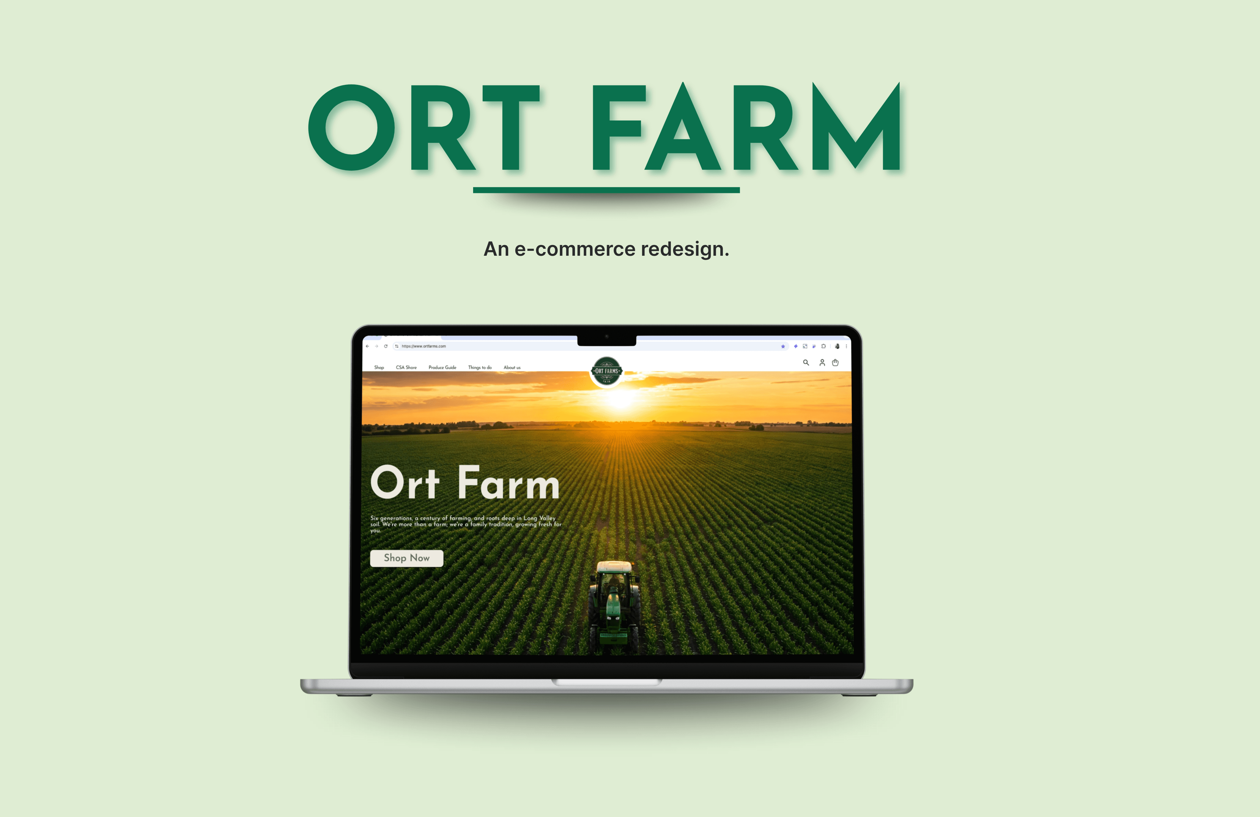
Ort Farms is a fifth-generation farm that is working to improve its online presence and better showcase its offerings.
My goal was to improve the experience of searching for and purchasing goods, making it quick and seamless.
Ort Farms is a fifth-generation farm that is working to improve its online presence and better showcase its offerings.
My goal was to improve the experience of searching for and purchasing goods, making it quick and seamless.
Role & Duration
Role & Duration
Lead Designer
UX Research, Design Thinking, Visual Design, Prototype & Testing
Feb - Mar, 2025
Research
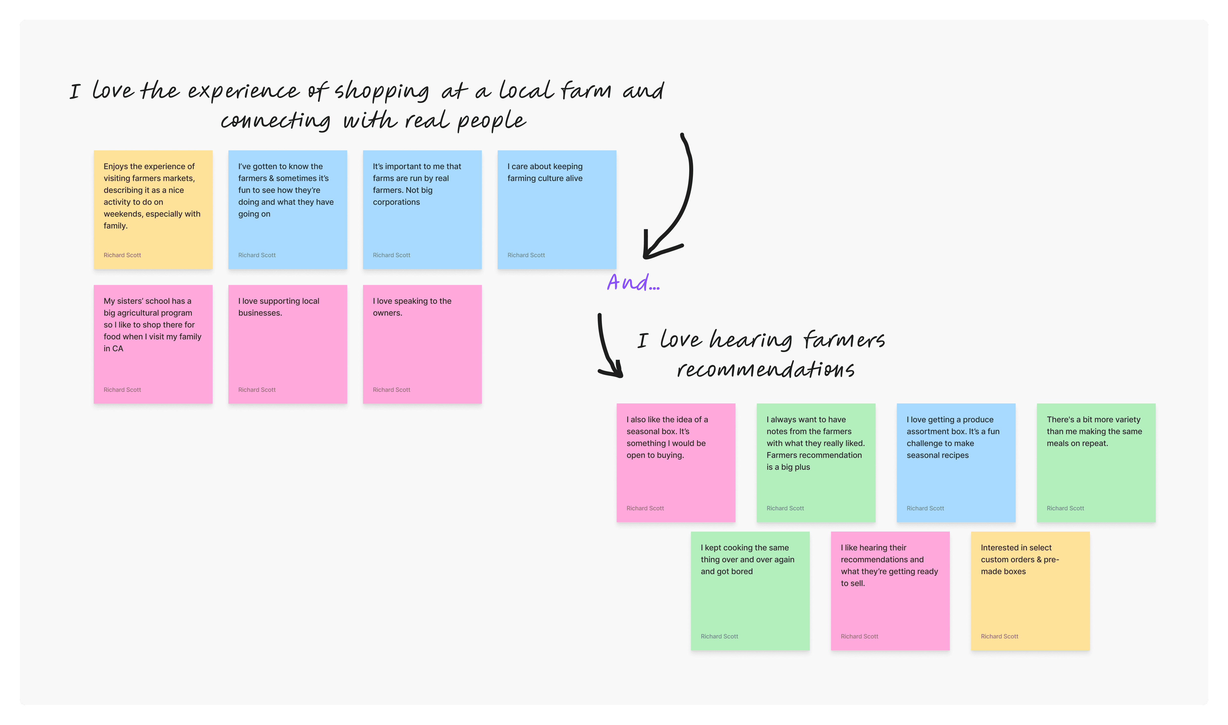
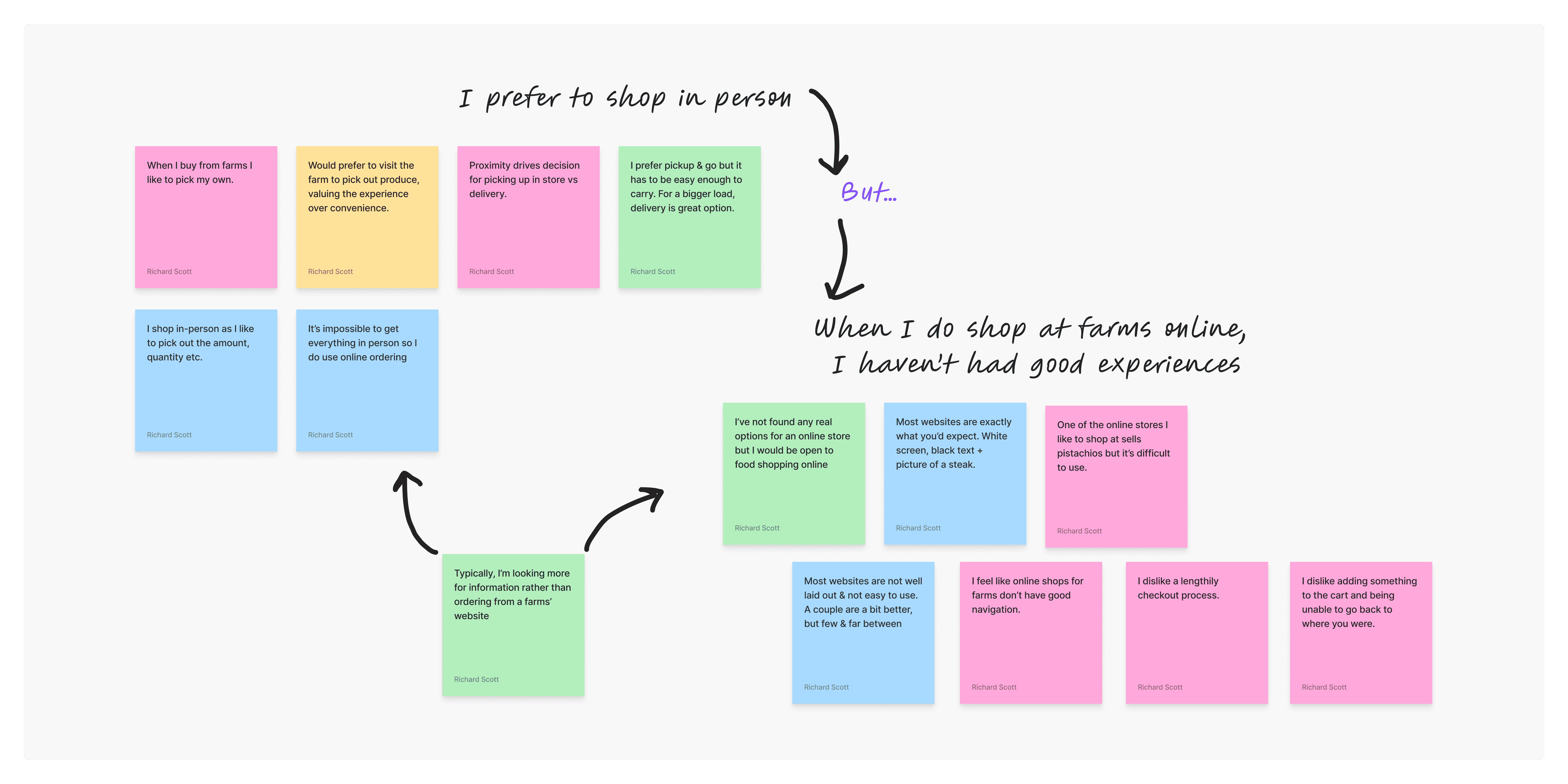
Research included 4 user interviews, card sorting, and a competitive analysis of 6 local businesses. These were: 3 local farms (varying in size) and 3 food & beverage related businesses. This would help me to understand the farm’s market context and better understand the reasoning behind its current website layout.
Insights
"It’s important to me that farms are run by real farmers. Not big corporations."
"I care about keeping farming culture alive."

"I always want to have notes from the farmers with what they really liked. Farmers recommendation is a big plus."
"One of the online stores I like to shop at sells pistachios but it’s difficult to use."
"I feel like online shops for farms don’t have good navigation."
Smaller competitors
Smaller competitors
Win on local charm and word-of-mouth but lack online and social presence.
Moderate competitors
Moderate competitors
Provide a pleasant in-person experience but may suffer from location disadvantages.
Larger competitors
Larger competitors
Excel in digital presence and popularity but risk losing local customers through overcrowding and high prices.
Affinity mapping allowed me to see the golden threads. What are users saying and how to make sense of it into usable information.
Understanding The Problem
While Ort Farms is enjoyed by locals for its in‑person market and seasonal attractions, the online shopping experience is noticeably less intuitive and user-friendly. Key issues include:
Discoverability
Activities and events are prioritized, while the Farm Market lacks intuitive navigation and searchability for food items.
Purchase Flow
Buried product pages and unclear calls to action lead to abandoned carts and a disconnect between online and in-person experiences.
Product Exposure
Many popular items are missing from the website with little to no information regarding seasonal produce.
Problem Statement
Sarah loves the personal connection and fresh produce she finds shopping at Ort Farms but needs a better way to learn about recommended products and upcoming events because the farms' website is difficult to navigate and doesn’t effectively present their offerings.
Understanding The Problem
While Ort Farms is enjoyed by locals for its in‑person market and seasonal attractions, the online shopping experience is noticeably less intuitive and user-friendly. Key issues include:
While Ort Farms is enjoyed by locals for its in‑person market and seasonal attractions, the online shopping experience is noticeably less intuitive and user-friendly. Key issues include:
Discoverability
Discoverability
Activities and events are prioritized, while the Farm Market lacks intuitive navigation and searchability for food items.
Purchase Flow
Purchase Flow
Buried product pages and unclear calls to action lead to abandoned carts and a disconnect between online and in-person experiences.
Product Exposure
Product Exposure
Many popular items are missing from the website with little to no information regarding seasonal produce.
Problem Statement
Sarah loves the personal connection and fresh produce she finds shopping at Ort Farms but needs a better way to learn about recommended products and upcoming events because the farms' website is difficult to navigate and doesn’t effectively present their offerings.
Solution & Conceptualization
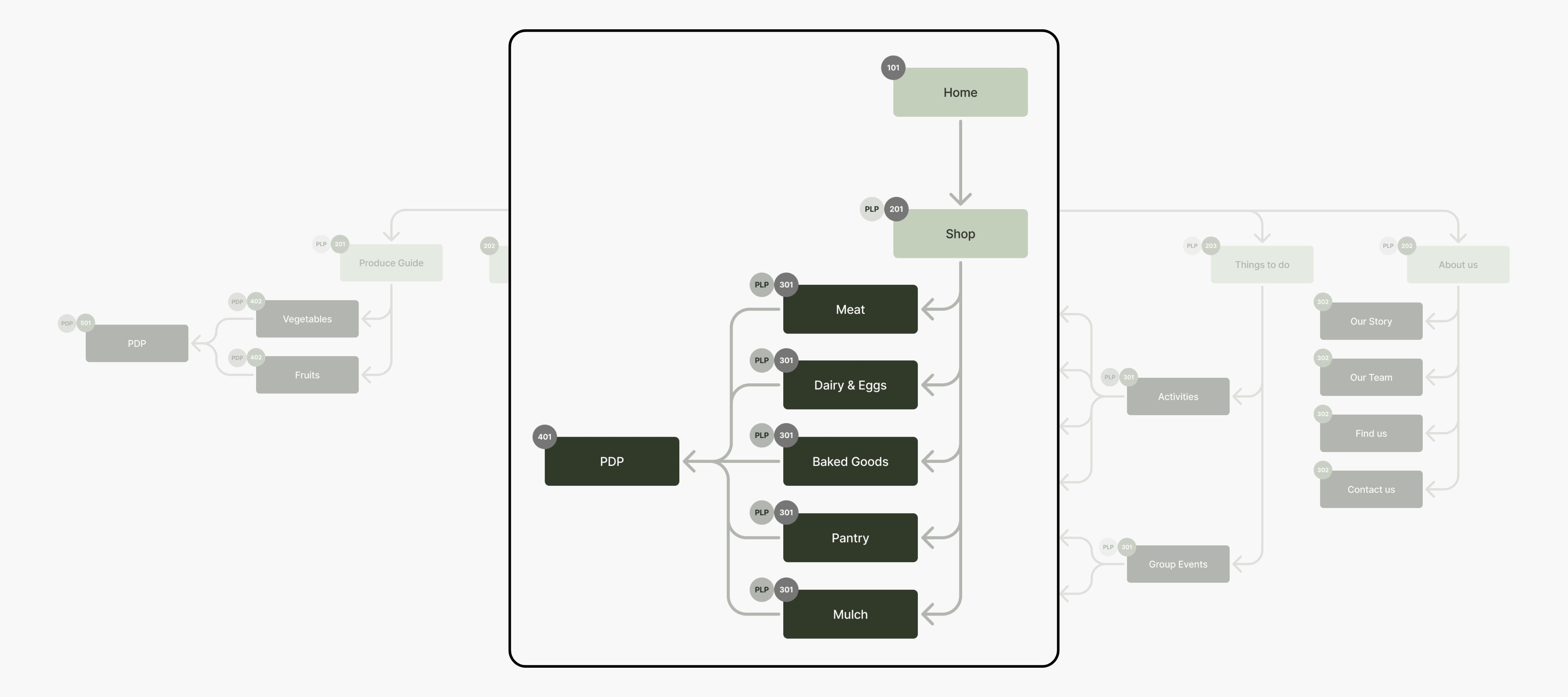
My attention was primarily focused on functionality, ensuring the information architecture was significantly improved upon. Key features included:
Improved Navigation with a clear 'Shop' tab for all food offerings
A dedicated section highlighting what's in season and how to use it
Product description pages (PDP's) for all products
Improved ability to add products to cart and navigate to check out
The redesign improved time on task by an average of 78% - meaning:
Faster checkouts = higher conversion rates
Reduced drop-off = more completed purchases
Improved user satisfaction = higher retention
Final Product
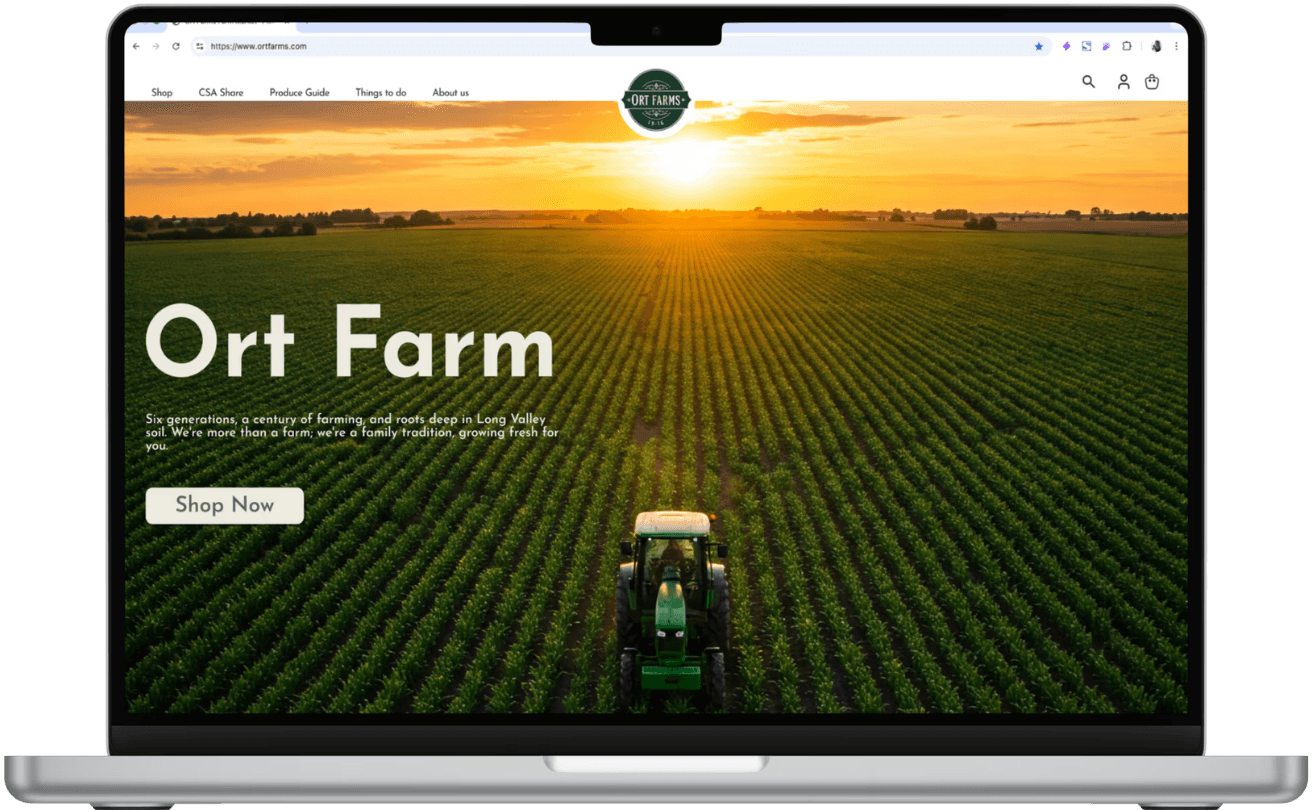
A strong hero image quickly captures the audience, while also giving immediate options to 'shop now' with a large call to action button and a clean nav bar.
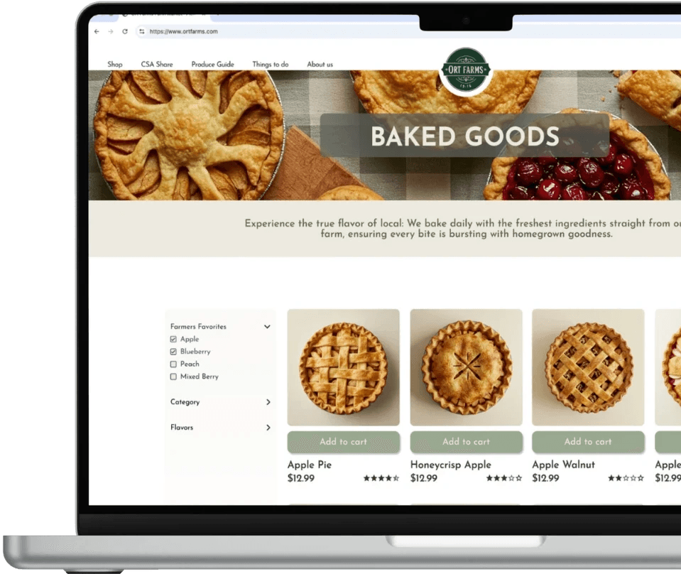
Product Listing Page (PLP)
The PLP page has improved navigation with beautiful images of products for sale. This page enables users to see all 'baked goods' offerings, which is one of many options within the 'shop' tab.
Additional features on this page:
A filter which enables users to find what they want, quicker
Farmers' recommendations that speaks to users interest in what's in season
Transparent pricing
CTA which enables items to be quickly added to the shopping cart
Product Description Page (PDP)

Users can learn more about products, as well as experiencing an improved ease at which items can be added to the card and purchased.
Information about allergies was also added to help users with any dietary restrictions.
I aimed for a color palette that truly reflected the farm: earthy greens, creams, and browns. Josefin Sans felt perfect for the typography. It's clean, readable style allowing the user to have an enjoyable experience and for the farms' message to stand out.

Conclusion & Learning
Throughout this project, I listened and referenced back to the user persona which helped me in making the right design decisions such as adding a farmers' recommendations section in the filter on the PLP.
Usability testing offered some useful feedback which sparked iterations before finalizing the product. As an example, the home screen had text overlay on two of the images. The readability was not very clear, so I made the decision to separate the text and image, and reorganize them in a way that was clean, clear & legible.
I found genuine fulfillment in my work for this project. It is my commitment to always producing my highest level of work and keeping the user front and center in my design thinking which helps me to deepen my understanding of the user.
Solution & Conceptualization
My attention was primarily focused on functionality, ensuring the information architecture was significantly improved upon. Key features included:
Improved Navigation with a clear 'Shop' tab for all food offerings
A dedicated section highlighting what's in season and how to use it
Product description pages (PDP's) for all products
Improved ability to add products to cart and navigate to check out
The redesign improved time on task by an average of 78% - meaning:
Faster checkouts = higher conversion rates
Reduced drop-off = more completed purchases
Improved user satisfaction = higher retention
Final Product
A strong hero image quickly captures the audience, while also giving immediate options to 'shop now' with a large call to action button and a clean nav bar.
Product Listing Page (PLP)
The PLP page has improved navigation with beautiful images of products for sale. This page enables users to see all 'baked goods' offerings, which is one of many options within the 'shop' tab.
Additional features on this page:
A filter which enables users to find what they want, quicker
Farmers' recommendations that speaks to users interest in what's in season
Transparent pricing
CTA which enables items to be quickly added to the shopping cart
Product Description Page (PDP)
Users are also able to read more information about the products, helping them to learn about what's in season which was an important discovery in my user research.
Information about allergies was also added to help users with any dietary restrictions.
I aimed for a color palette that truly reflected the farm: earthy greens, creams, and browns. Josefin Sans felt perfect for the typography. It's clean, readable style allowing the user to have an enjoyable experience and for the farms' message to stand out.
Conclusion & Learning
Throughout this project, I listened and referenced back to the user persona which helped me in making the right design decisions such as adding a farmers' recommendations section in the filter on the PLP.
Usability testing offered some useful feedback which sparked iterations before finalizing the product. As an example, the home screen had text overlay on two of the images. The readability was not very clear, so I made the decision to separate the text and image, and reorganize them in a way that was clean, clear & legible.
I found genuine fulfillment in my work for this project. It is my commitment to always producing my highest level of work and keeping the user front and center in my design thinking which helps me to deepen my understanding of the user.
Overview
Overview
Ort Farms is a fifth-generation farm that is working to improve its online presence and better showcase its offerings.
My goal was to improve the experience of searching for and purchasing goods, making it quick and seamless.
Ort Farms is a fifth-generation farm that is working to improve its online presence and better showcase its offerings.
My goal was to improve the experience of searching for and purchasing goods, making it quick and seamless.
Role & Duration
Role & Duration
Lead Designer
UX Research, Design Thinking, Visual Design, Prototype & Testing
Feb - Mar, 2025
Research
Research included 4 user interviews, card sorting, and a competitive analysis of 6 local businesses. These were: 3 local farms (varying in size) and 3 food & beverage related businesses. This would help me to understand the farm’s market context and better understand the reasoning behind its current website layout.
Insights
"It’s important to me that farms are run by real farmers. Not big corporations."
"I care about keeping farming culture alive."
"I always want to have notes from the farmers with what they really liked. Farmers recommendation is a big plus."
"One of the online stores I like to shop at sells pistachios but it’s difficult to use."
"I feel like online shops for farms don’t have good navigation."
Smaller competitors
Smaller competitors
Win on local charm and word-of-mouth but lack online and social presence.
Moderate competitors
Moderate competitors
Provide a pleasant in-person experience but may suffer from location disadvantages.
Larger competitors
Larger competitors
Excel in digital presence and popularity but risk losing local customers through overcrowding and high prices.
Affinity mapping allowed me to see the golden threads. What are users saying and how to make sense of it into usable information.
Understanding The Problem
While Ort Farms is enjoyed by locals for its in‑person market and seasonal attractions, the online shopping experience is noticeably less intuitive and user-friendly. Key issues include:
While Ort Farms is enjoyed by locals for its in‑person market and seasonal attractions, the online shopping experience is noticeably less intuitive and user-friendly. Key issues include:
Discoverability
Discoverability
Activities and events are prioritized, while the Farm Market lacks intuitive navigation and searchability for food items.
Purchase Flow
Purchase Flow
Buried product pages and unclear calls to action lead to abandoned carts and a disconnect between online and in-person experiences.
Product Exposure
Product Exposure
Many popular items are missing from the website with little to no information regarding seasonal produce.
Problem Statement
Sarah loves the personal connection and fresh produce she finds shopping at Ort Farms but needs a better way to learn about recommended products and upcoming events because the farms' website is difficult to navigate and doesn’t effectively present their offerings.
Solution & Conceptualization
My attention was primarily focused on functionality, ensuring the information architecture was significantly improved upon. Key features included:
Improved Navigation with a clear 'Shop' tab for all food offerings
A dedicated section highlighting what's in season and how to use it
Product description pages (PDP's) for all products
Improved ability to add products to cart and navigate to check out
The redesign improved time on task by an average of 78% - meaning:
Faster checkouts = higher conversion rates
Reduced drop-off = more completed purchases
Improved user satisfaction = higher retention
The redesign improved time on task by an average of 78% - meaning:
Faster checkouts = higher conversion rates
Reduced drop-off = more completed purchases
Improved user satisfaction = higher retention
Final Product
A strong hero image quickly captures the audience, while also giving immediate options to 'shop now' with a large call to action button and a clean nav bar.
Product Listing Page (PLP)
The PLP page has improved navigation with beautiful images of products for sale. This page enables users to see all 'baked goods' offerings, which is one of many options within the 'shop' tab.
Additional features on this page:
A filter which enables users to find what they want, quicker
Farmers' recommendations that speaks to users interest in what's in season
Transparent pricing
CTA which enables items to be quickly added to the shopping cart
Product Description Page (PDP)
Users are also able to read more information about the products, helping them to learn about what's in season which was an important discovery in my user research.
Information about allergies was also added to help users with any dietary restrictions.
I aimed for a color palette that truly reflected the farm: earthy greens, creams, and browns. Josefin Sans felt perfect for the typography. It's clean, readable style allowing the user to have an enjoyable experience and for the farms' message to stand out.
Conclusion & Learning
Throughout this project, I listened and referenced back to the user persona which helped me in making the right design decisions such as adding a farmers' recommendations section in the filter on the PLP.
Usability testing offered some useful feedback which sparked iterations before finalizing the product. As an example, the home screen had text overlay on two of the images. The readability was not very clear, so I made the decision to separate the text and image, and reorganize them in a way that was clean, clear & legible.
I found genuine fulfillment in my work for this project. It is my commitment to always producing my highest level of work and keeping the user front and center in my design thinking which helps me to deepen my understanding of the user.